Friday 18 December 2015

Final Music Video


This is our final and finished music video.
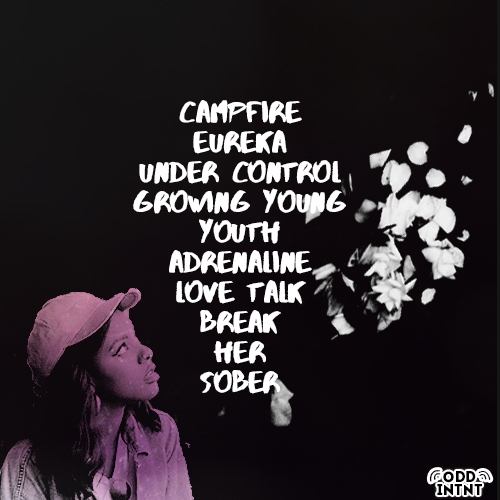
Lia Tamera - Under Control 

Thursday 17 December 2015

Final Magazine Advert


This is our final third finished ancillary text - our newspaper advert.

Final Poster


This is our second final, finished ancillary text - our poster.

Final Digipak

This is our first and final finished ancillary text - our digipak.
Lia Tamera - The Kids Aren't Alright

Front Cover


First Inner Cover


Second Inner Cover 


Back Cover

Spine


Tuesday 8 December 2015

Editing Inspiration: Anderson .Paak

When editing the beginning of our music video, we decided to play with and make use of the music in order to fit it in with the jump cuts; this way our audience would be more likely to relate the beginning of 'Under Control' with the music video, helping to create synergy.


The idea for having the opening second shot in black and white as well as the placement of the font was from singer/producer Anderson .Paak and his 2014 song 'Luh You'. We felt that this would make our music video stand out and become very distinctive.


The quick cuts show different symbolic moments of the music video so that audience members can catch a glimpse of the different elements of our music video. We chose to use shots that featured our artist near nature as this would contrast greatly with the array of colours we later show in the music video.

The idea of the font also came from this music video as it distinctly informs the audience of the song title, artist and director in an artistic style.

Friday 4 December 2015

Editing Inspiration: Beyoncé

When editing our match cuts, we gained inspiration from other artists. Beyoncé's 2006 song, 'Freakum Dress' features several of these shots in which she changes outfit. We were influenced by this and tried to recreate it in our own way.


In this shot, you can see our artist changing her clothes in a photo booth. After being influenced by Beyoncé, an artist who fits into the musical genre we're basing our artist on, we decided to similarly change her outfit in a quick match cut. Looking at this shot, I realise that the lighting seems quite warm and therefore heavy on the yellow tones, especially due to the harsh light on the left hand side of the artist's face due to the photo booth we shot in and so this is something I'd like to change if we had the technology to effectively alter it, without the shot looking too distorted.


In Beyoncé's Freakum Dress, you can see a similar match cuts where she changes her outfit mid shot, which allows the audience's attention to focus to that aspect which relates back to the lyrics of her song. We chose to highlight the clothing in our music video, in particular in this shot, because we wanted to reference back to our target audience and the fashion style that they are used to; which would therefore allow them to relate to our artist, which makes our music video accessible to a larger audience.

Thursday 3 December 2015

Editing Margate Footage and Feedback

When editing the footage from Margate we came across one problem which we worked hard to correct. During the arcade shots, there were people in the background and so we tried to edit around them when editing our music video. In order to do this, we inserted other clips and used jump cuts to flick between the two. I think in the end this looked effective.


When we received feedback from Mr Higgins, he said there was one shot he liked by far. This shot taken in Margate on the beach features, me as the artist, walking along a sand dune. Mr Higgins said he liked the equality of the shot, how it was mirrored nicely, the artist was in the centre of the frame and the colours of the shot contrasted nicely.


Monday 30 November 2015

Refilming in Margate

Wanting to have a change of scenery, we decided to film in Margate. This was because we had filmed in various London locations which meant that we had a lot of vibrant, industrial shots and we also had completely contrasting shots that we filmed in Camber Sands, along the beach. We wanted to find somewhere in the middle of those two places and after research and discussions we felt Margate was the best place to film.

Initially, we felt this because we planned to film in Dreamland and we felt with the bright lights and colours, it would fit with the aesthetic feel of the music video. After later research we realised there was an art gallery, Turner Contemporary, which we found out had a exhibition based on the idea of Risk and we liked the visual look of some of the artwork.

When arriving in Margate initially the weather was bareable, slightly cold, but it didn't deter us; however as we filmed later on, the wind picked up especially as we were by the coast and it began to  get colder.

Once arriving at Dreamland, we were disappointed with the amount of displays and lights as we thought there would be more; we also hoped to film on the roller rink but realised there were too many people that would end up in the background and so we decided not to.

Heading inside we found a glass light display which was perfect and so we filmed a few lip syncing shots near that area. We also found a photo booth and we decided to film a match cuts of myself changing my outfit; as we found out from our previous feedback that many people liked this and found it effective.


Filming in the art gallery was successful as we managed to get a variety of shots that matched the bright colours from earlier.

However, we also managed to film some soft pastel scenes which balance out the gaudy lights that reoccur throughout our music video.

Unable to film any lip-syncing videos, we instead focused on filler shots, my favourite shot being the one when I walk into the projection as it mirrors the previous intertextual shots.


We also filmed in and around the art gallery and managed to get a variety of shots.


My favourite shots were the ones we filmed in the arcade as the bright colours and vivid background made the shot eye catching and interesting.


Wednesday 25 November 2015

Editing London Footage and Feedback

When editing our footage, after feedback from our target audience (which will be posted at a later date) we decided to move the original match cut later on in the music video, so it matched the music and fit better making it more impacting. I think it looks a lot more effective now and grabs the attention of our audience.

(This video was from before we moved the clip)


When receiving feedback, Mr Higgins said that one of our shots looked like we had filmed it on a green screen, which we hadn't, but we felt that it showed how much we focused on the smaller details. Choosing our locations with careful precision and deciding upon exact movements helped this come across.


Monday 23 November 2015

Refilming in London

We decided to refilm in London after listening to feedback that said we needed to have more solo shots of the artist in order to establish the artist and their image.

We decided to revisit the same places that we went to last time so that we could get similar shots in the same location, but also have the benefit of featuring a different outfit as this coincides with Andrew Goodwin and his theory of music videos. Filming in Camden and in various locations allowed us to have a larger variety of both lip syncing and filler shots to use in the music video.

The weather luckily enough was okay and we were able to film without disruptions such as rain or extreme wind. Filming in the winter also means that we had less daylight hours so we wanted to make use of them the best we could.

It was here we filmed some really good shots that featured soft colours and nature which became a key element in our music video.


Monday 16 November 2015

Initial Music Video Feedback

Once we edited our music video, we got some feedback from Mr Higgins and Miss Green.

At first, Mr Higgins questioned the reason behind using Charlotte in the music video, but we felt that she added extra visual content to the music video. He felt that she drew away from the artist and their representation. Our music video didn't have a narrative, something we decided upon very early on and so because of this, and because she didn't lip sync or add to the music video, Mr Higgins didn't understand the reasoning behind her being there. He felt our music video could be stronger without her. After discussions, we decided to use minimal shots of Charlotte to correct that and focus on myself as I am the artist. We wanted to keep some shots which involved Charlotte such as our match cut, but the rest we decided to edit out and refilm later.

He also stated that we hadn't used the best of our clips and we should think of our framing. He also said that we should think closer about our beginning and possibly use shots of myself to establish myself as the artist from the start.


One thing both himself and Miss Green liked was our match cuts. They felt it was effective and captured the audiences' attention, leaving a long lasting impression.

Happy with the response we got, we decided to film another similar shot to include somewhere else in the music video, so that it could become a reoccurring element.

Friday 13 November 2015

Third Ancillary Text

When planning the third element of our ancillary texts, we knew we wanted to target a wide range of audience members. We thought of the various ways we can reach a wide demographic:

  • Magazine Front Covers
  • Magazine Articles
  • Newspaper Ads
  • Social Media
With pros and cons to each, we thought about which would benefit our artist the most.

Magazine Front Cover

Magazine front covers are a good way to get exposure for an up and coming musician. There are a wide variety of magazines, but most likely the most beneficial would be music magazines; as their consumers are going to fit our target audience better.

Some popular music magazines include 
  • Rolling Stone
  • Q
  • NME (New Musical Express)
  • Kerrang!
  • Clash
Whilst this would be beneficial for our artist in terms of promotion and marketing; we feel that it doesn't suit our artist. We feel that the genre of music we're creating, Neo Soul, R&B, Trip Hip Hop wouldn't suit a mainstream audience; which is often who these types of magazines appeal to.


Magazine Articles

Magazine articles are an effective way for potential fans and audiences to discover and get to know an artist personally. It gives them a deeper insight to the musician as a person, rather than just their music.

Music magazine articles who write and publish introducing features on a new artist, often help said artist to break out into the industry and gain a larger network of consumers. Using cross media convergence, the magazine can work with the artist to help promote them.

Similar to magazine front covers, this would promote our artist well, but perhaps too help and might end up marketing them to a larger, and therefore more vaguer audience. Our artist is keen to target a certain demographic of audience members as they produce music that not everyone as heard of, which relates back to our findings from our target audience.

Newspaper Adverts

Arguably considered, one of the oldest forms of media, newspapers have been in the public and therefore society for an incredibly long time.

By featuring an advert in a newspaper, you target a certain demographic of people; as it's well known that the youth of today don't read newspapers and prefer to stick to digital forms of technology and social media.

Newspaper adverts would target young adults, most likely those at university, or business owners, budding entrepreneurs and older.

This advert published in a newspaper includes key dates and important notes for the consumer, all in bright colours so that they're able to quickly glance at it and remember all the information.

We feel that we will use a newspaper advert as our third ancillary text.


Social Media


Social Media has grown incredibly quickly in the past decade, with many young people using it constantly.

Marketing our artist on social media would be the quickest way to promote her; however, because social media is so vast we would have to carefully decide what social media website to market her on.

The cons of social media also include being unable to truly remove anything once it is posted and so we'd have to be extremely careful as anyone can take work that our artist has created and claim it as their own. With social media, things such as copyright have to be considered so that plagiarism and content theft can be swiftly dealt with.

Wednesday 11 November 2015

Digipak Variations

After deciding on our digipak ideas and how we wanted them to look overall, we made different variations before deciding on which would best fit the artist, overall digipak and which would create synergy with our ancillary texts.

Digipak Inside Third Page


This was the original inside third page of our digipak, but we realised it didn't match with the rest of the digipak and the overall theme we were trying to achieve, With purple being the main colour scheme that ran throughout, this page lacked that colour and so it wouldn't create synergy as an overall product. 

I preferred this version as I felt it was brighter and captured the attention of audience members and consumers easier; but it didn't fit well as so we decided to redesign it. 

We also felt that the title of the album, 'The Kids Aren't Alright' was too wavy which meant it might prove difficult for people to read and understand the text. 

Digipak Back Cover


This was the first design of the back cover of our digipak. With the black background and white font, we designed this so that it was easy for people to read. We felt that our artist would want their music and content to be easily accessible for people of all abilities which is why we used the contrasting colours. Using a purple filter to colour in the artist, added the purple colour scheme back into this part of the digipak however, after discussions, we felt it wasn't enough purple and it wouldn't create synergy with the rest of the digipak. 

We also finalised a logo, seen at the bottom of our album cover. We also need to include other company/record label logos, barcodes, explicit content warnings etc. 

Monday 9 November 2015

Music Video Editing

We edited our music video very easily initially. We wanted the shots we had filmed to flow in time and highlight the beat of the song which is something we focused on during the beginning of the music video.


When it came to editing we realised we had more filler shots than shots of myself lip-syncing which meant that overall the music video began to look more of a montage of shots rather than an actual music video. We decided that we would need to re film so that we could include more shots of myself lip syncing. I feel that so far, the music video does look very good, there's a clear theme running throughout and the aesthetic that we hoped to achieve, I think we achieved. There was a few shots we were unhappy with such as one of myself lip-syncing, once we fit it in we realised that it didn't match in time with the music so we'd have to reshoot that. 

We also discovered it was very easy to edit the match cuts together and it looked very impressive, a key shot that stood out amongst our music video, it's something we want to film more of so that it can become more of a theme that runs throughout our music video; seen hopefully two or three times in total.

There was a few shots we didn't like the lighting in, such as the intertextual shots but we changed this by editing the colour. Originally the shots looked very blue and so after changing the lighting we managed to make my body look like a silhouette and the projection the focal point as a tongue in cheek reference to the band, The Internet. 

In the end we managed to use a 60% filler shot, 40% lip syncing shots to complete our music video. Whilst we know we aren't finished, we wanted to make sure that we had used enough shots so that essentially the music video editing is done and therefore once we reshoot we can just replace any shots we don't like with the new ones.

Now we can focus on the poster and digipak.

Wednesday 4 November 2015

Intertextual Reference

We decided our music video needed more dynamic shots of myself and so we wanted to include an intertextual reference of The Internet.

We wanted to film a few shots that looked completely different to the rest of our music video; we considered the idea of silhouettes and so we decided to film some shots of myself in front of a projector. Using The Internet and their music video for Get Away as an intertextual reference, we captured a few shots of myself dancing in front of the screen.


I think the overall shot ended up looking good and fit the theme of our music video. When reviewing our content, we realised several people had similar ideas, so we decided to create something slightly different. Whereas most people had overlayed their background image on top of their artist, we decided to completely blank out our artist to show her silhouette. We felt that by doing this, this scene would stand out and add some contrast.

We wanted to include an intertextual reference into our music video as we knew it was something Andrew Goodwin had mentioned in his theory of music videos. We wanted our music video to be memorable and distinguishable from others with a similar genre so we decided to include almost a tribute to the original group, The Internet, in the background.

We felt that 'Get Away' aesthetically fit the theme of our music video and so that was why we chose that particular music video of theirs to play in the background. This song also came from the same album, 'Ego Death' as 'Under Control', which meant that they had similar themes and references.

I personally think that the silhouette ended up looking very prominent and stood out. The artist was able to be noticeable against the background.

EDIT

Initially, Mr Higgins had stated that he felt that this particular scene didn't work with the rest of our music video; and so after refilming some of our shots, we reworked these scenes and they fit a lot better.

Monday 2 November 2015

Music Video Filming (Behind the Scenes)

We filmed in two main places, the busy location of Camden which features a lot of street art and vibrant colours and the much more calmer and overall serene Camber Sands. We purposely wanted the two locations to contrast each other which would make the music video much more visually entertaining to watch.

Camden & Camden Lock

Filming in Camden proved to be very straightforward we had no problems and I found the lip syncing very easy although at times I was a bit nervous to do it in public, I think it became easier as Milly was filming and therefore had a camera so it made what we were doing a bit more obvious. Choosing to film in quirky, off the cuff places such as graffiti walls and small niche places that featured nature or bright neon lights really helped convey the overall look we wish to achieve for our music video. The lights would have looked a lot more nicer and brighter if we shot at night, but we were conscious of loosing light and filming enough footage. A lot of the shots we filmed were filler shots, small shots that could be used as a transition piece in our music video; these featured both Charlotte and I. Whilst filming Milly also took pictures that could be used for our poster and digipak as we were keen to make sure that a similar theme runs throughout.


Camber Sands

Our second location we filmed in was Camber Sands, a small sandy beach on the coast of Camber. Once again we filmed a variety of shots, I really liked the camera angles we achieved when I was lip syncing as it will make the music video a lot more visual. We wanted to complete a match cuts that we started in Camden, a medium over the shoulder shot of Charlotte and I. I'm holding a picture and I look over my shoulder at the camera which is something we matched up. I was surprised at how easily we managed to frame the shots so it would edit together seamlessly. We again filmed some filler shots of Charlotte and I walking which we could edit in to show mirroring between the two locations. We decided we wanted to use a pan to end the song and decided to record it with myself sitting down and looking up at the sky. One problem we encountered, besides the cold temperatures, was the camera. We shot mid afternoon, just before sunset, however the camera couldn't detect the difference between the sea and the sky and so it blurred the two colours together and made a lot of the shots look white.

Monday 19 October 2015

Storyboarding

When creating our storyboard we knew it wouldn't match the music video exactly as we were going for a conceptual music video and we were also filming on location which meant there was a lot of factors that might have hindered us from achieving the camera shots/angles we hoped to achieve. 


A lot of the storyboard are various ideas that we had for the music video that we hope to try out and then we'll review the footage later. We decided to structure our music video like this because its conceptual based and therefore it's hard to determine how it'll turn out. Ideas for a good shot might not look as visually pleasing as we had originally hoped once we look back on it; likewise we might have really good ideas for shots but when it comes to filming on location it might not work or unforeseeable factors might prohibit us from filming. 


We hope to include a variety of angles and shots that fit with the conceptual theme as well as using clever editing to show match cuts. We gained a lot of inspiration from both Western and international artists and their music videos; the idea of using a cleverly editing match cuts 0i...
s something we want to try as we feel it'll make our music video stand out and link nicely with the concept that we are hoping to achieve. Low and high angle shots is another thing we hope to try as it makes the content more interesting for audience members to watch, it forces them to watch from another angle that they're not used to watching content from - therefore it stays longer in their head.


Overall, we want the music video to have a chilled, relax sort of vibe about it. We want it to be aesthetically pleasing to watch and therefore hope to have a colour theme that runs throughout. We want the visuals of the music video to reflect the message of the song, that the protagonist has it under control but there's an element that is slightly slipping, a facade. 

Friday 16 October 2015

What is a Poster?

For part of our coursework, we have to create a music poster, which advertises our artist's debut album effectively, keeping in with the conventions of a poster.

Conventions of a music poster:

  • General colour scheme
  • One main image
  • Image should represent album/artist
  • Similar theme to album

For the poster, we decided to shoot pictures when filming as we'll be able to have a similar theme throughout, which will fit the conventions and help the consumers and our target audience find the correlation between our ancillary texts. We thought of using a naturalistic shot so that it would work well with the nature theme for our digipak, as well as referencing the music video.

Gorillaz - Plastic Beach


In this promotional poster for band Gorillaz, it features one main picture - the location and inspiration for the album title. The text then appears over the top and features hardly any information. It simply states the band's name, album name, the release date for the album, the artist's website and finally the record label. The dark tone sets the theme of the album and music genre, Alternative Rock.

One element I really like from this poster is the font used for the title and the way it has the wave motion which reflects the sea underneath. This is something I'd like to incorporate into our poster as it would link nicely to our nature theme,

Ariana Grande - My Everything 


This album poster, likewise to the Gorillaz, has one main image of the artist this time. The colour scheme is kept black and white, with only the album title in a soft pink which alludes to the Bubblegum Pop genre of the album. This poster has more information with several collaborative artists being listed, which is a technique used to encourage consumers to buy the album as they'll hopefully recognise some of the featuring artists. This poster also has the release date, a website and the label logo on the bottom.

The key things that stand out besides the artist who is placed in the direct centre, is the title of the artist and album and the release date; as clearly they are the most important. However, the extensive list of featuring artists draws and captivates attention and so this is possibly something we might consider including in our album so that our artist can get a wider range of marketing and promotion. 

Thursday 15 October 2015

Production Schedule

We plan to film for the length of just over one week. Starting from Thursday 22nd October to Friday 30th October we intend to film our music video as well as take still images to use in our digipak and poster.

Monday 26th October: Planning preparation
Tuesday 27th October: Train/Camden/Tube station filming
Wednesday 28th October: Digipak/Poster photoshoot
Thursday 29th October: Camber Sands
Friday 30th October: Extra filming


Filming the entire music video will be Milly, whilst I will be the artist. To add context and a wider, diverse range of demographic we decided to choose Charlotte from the auditions to also feature in our music video; whilst she won't be lip syncing, she'll make the music video more visually interesting to watch. This is something that is done in many music videos, such as Dumbfoundead - BKFAM; the music video feature various people in the background who don't lip sync but add an extra dynamic element to the music video.


We'll be using a camera and a tripod to film our music video. The camera is able to take both high quality photos and shoot video, so we'll be able to film and take pictures at the same time if we need to. Using a tripod will allow us to film both high angle and low angle shots which will make our music video more dynamically interesting for the audience to watch. As we're creating a conceptual music video, it focuses more on the aesthetic feeling of the music video and the visuals which includes the variety of camera shots and angles.

We aim to film the entire music video during this week so that we can focus on editing. Once we've finished filming we can review our content and once we edit it together, we can decide if we need to film any reshoots.

Wednesday 14 October 2015

What is a Digipak?

A digipak is 'a type of packaging for CDs or DVDs, typically made from cardboard with an internal plastic holder for one or more discs.' This is an aspect of the coursework; we have to design and create a digipak as part of our ancillary texts to go with our music video and fit our artist style. 


When planning our digipak, due to the fact that we had filmed in various contrasting locations; we tried to think of a theme that runs throughout. We thought the theme of nature could be interesting to work with, as we shot near a lot of plants in Camden and we also shot on the beach, so to show the contrast between the two locations would fit in with the theme of the song and the lyrics.

1975 - 1975


When looking at digipaks, the first I decided to study was 1975's self titled debut album. They establish the style of their music very quickly by the use of their monochromatic colour scheme. Keeping this theme throughout, even on their physical CD, their Indie Rock genre is not shocking for the consumer. It informs possible consumers on their brand, image and style before they have even brought the product.

This inspired us when discussing and planning our digipak, we wanted our artist's distinct style to be expressed through the synergy across all our ancillary texts. We also wanted our colour scheme to express our artist's style and overall sound of music so that our consumer would be able to judge what genre of music they'd be paying for.

The 1975 also have a thanks page in which they pay thanks to all that have helped them along the way. This is important for a debut artist as it acknowledges several people in the industry and helps them make connections, it also gives an artist an opportunity to thank fans, which helps them gain more and therefore propel their fame and career.

Will Harrison - A Place Called Home


In this digipak, likewise to The 1975, the artist style is very distinct, American Folk, Country. Will Harrison also has a theme that runs throughout his digipak, so that fans can see the similarities across it. The background runs across all the pages along with the tree; we felt that it would be effective if we had a nature element that could feature various times throughout. 

Tuesday 13 October 2015

Prop and Costume Planning & Research

Keeping in with our artist style mood board we wanted to go for a casual look for our music video as it reflects the feel and message of the song. We didn't want to use props as we felt it was unnecessary and wouldn't fit in with our concept.

Again with costumes, we felt that both Charlotte and I have a similar sense of style which represents the look we're going for in our music video.

EDIT

Now having filmed, I feel that my Camden outfit fit the artist style mood board that we created earlier on.

It features the use of a denim jacket and noticeable sports wear brands such as Nike, which help make the outfit anonymous.  The colour scheme is mainly soft pastels which fits well with the colour palette of Camber Sands and matches with the sea.

Adding touches of base metals such as rose gold jewellery helped these items sound out against the soft muted colours in the music video.


When we filmed in Camden Lock the second time, I went for a casual urban style which fit the location.

Wearing a large, bright green Nike branded hoodie would allow myself as an artist to be noticed and help make our music video stand out. It also fit in well with the bright colours of our location and the bright themes we aimed to include throughout.

Wearing an Adidas beanie did conflict as I was wearing two well known, popular and hugely successful sporting brands. However, this would only draw more attention to our artist and their choice in style.


This chosen outfit was worn during our Margate filming shoot. Adding a touch of femininity to all the previous looks we has decided upon, this stood out and soon became one of my favourite looks.

Still keeping with the brands theme, I wore a vintage Nike cap and an Adidas top. We felt that it could become a running joke for our artist, a way for her fanbase to identify her, by consistently mixing popular brands. Wearing an oversized jean jacket added masculinity back into the outfit, along with the black lace up boots which helped us stick to the anonymous style we wanted to achieve.


Monday 12 October 2015

Independent Record Label Logo: Odd Internet

As mentioned in an earlier blog post, we created Odd Internet as an independent record label.


We designed this simple, yet effective logo that would allow our brand to become distinctive compared to other logos. The black and white colour scheme stands out against colourful backgrounds, which is something we intend to have as a running theme throughout our ancillary texts. The shortening of the word 'Internet' to 'INTNT' was done to make the logo more current and contemporary; it also looks stylistically pleasing to look at. It makes the logo shorter, impacting and snappy. The two symbols at the top represent both sound waves that comically are seen projecting from speakers but also links to the WiFi symbol. The sound waves instantly inform the consumer that this is a music industry company and that we release music. The WiFi connotations link back to our name 'Odd Internet' which stems from the two groups we took inspiration from when creating our artist, 'Odd Future' and 'The Internet'. The name indicates that as a company we have future aspirations that aren't solely focused on music, we intend to reach our consumers on various media platforms such as using the internet to achieve this.

Friday 9 October 2015

Auditions

We held auditions for someone to feature in our music video alongside myself and whittled it down to a total of four people. The person we cast isn't required to lip-sync as they aren't the artist, I am, and so they will be used purely to make the music video more dynamic and visually interesting. 


Sophie Baxter

Sophie had a good sense of fashion, which is something we were keen about because it's something that's important to our conceptual music video. Whilst she does have a good sense of fashion, overall we think it doesn't fit the theme we wish to portray and the message of the song/lyrics.


Georgina Welton


Georgina looked like she fit the general look we was going for; however there was a few things that didn't fit our concept - such as her fashion style. Whilst it was good it didn't match the casual almost androgynous look that we hoped to achieve, Georgina overall is a lot more feminine which reflects in the way she dresses.


Caitlin Mettle


Caitlin looked too sweet to cast in our music video; through no fault of her own if we had casted Caitlin she would have made the music video seem almost too youthful. Her fashion sense fit the theme and overall concept which is annoying as she would have been the perfect candidate.


Charlotte Springate


Charlotte was the ideal candidate. Her fashion sense matched the concept completely and she also had the right mix of androgyny which fit the aesthetic we were hoping to achieve.