Digipak Inside Third Page

This was the original inside third page of our digipak, but we realised it didn't match with the rest of the digipak and the overall theme we were trying to achieve, With purple being the main colour scheme that ran throughout, this page lacked that colour and so it wouldn't create synergy as an overall product.
I preferred this version as I felt it was brighter and captured the attention of audience members and consumers easier; but it didn't fit well as so we decided to redesign it.
We also felt that the title of the album, 'The Kids Aren't Alright' was too wavy which meant it might prove difficult for people to read and understand the text.
Digipak Back Cover
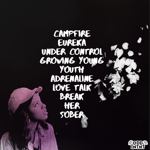
This was the first design of the back cover of our digipak. With the black background and white font, we designed this so that it was easy for people to read. We felt that our artist would want their music and content to be easily accessible for people of all abilities which is why we used the contrasting colours. Using a purple filter to colour in the artist, added the purple colour scheme back into this part of the digipak however, after discussions, we felt it wasn't enough purple and it wouldn't create synergy with the rest of the digipak.
We also finalised a logo, seen at the bottom of our album cover. We also need to include other company/record label logos, barcodes, explicit content warnings etc.
No comments:
Post a Comment