Conventions of a music poster:
- General colour scheme
- One main image
- Image should represent album/artist
- Similar theme to album
For the poster, we decided to shoot pictures when filming as we'll be able to have a similar theme throughout, which will fit the conventions and help the consumers and our target audience find the correlation between our ancillary texts. We thought of using a naturalistic shot so that it would work well with the nature theme for our digipak, as well as referencing the music video.
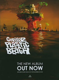
Gorillaz - Plastic Beach
In this promotional poster for band Gorillaz, it features one main picture - the location and inspiration for the album title. The text then appears over the top and features hardly any information. It simply states the band's name, album name, the release date for the album, the artist's website and finally the record label. The dark tone sets the theme of the album and music genre, Alternative Rock.
One element I really like from this poster is the font used for the title and the way it has the wave motion which reflects the sea underneath. This is something I'd like to incorporate into our poster as it would link nicely to our nature theme,
Ariana Grande - My Everything
The key things that stand out besides the artist who is placed in the direct centre, is the title of the artist and album and the release date; as clearly they are the most important. However, the extensive list of featuring artists draws and captivates attention and so this is possibly something we might consider including in our album so that our artist can get a wider range of marketing and promotion.


No comments:
Post a Comment