Monday, 30 November 2015

Refilming in Margate

Wanting to have a change of scenery, we decided to film in Margate. This was because we had filmed in various London locations which meant that we had a lot of vibrant, industrial shots and we also had completely contrasting shots that we filmed in Camber Sands, along the beach. We wanted to find somewhere in the middle of those two places and after research and discussions we felt Margate was the best place to film.

Initially, we felt this because we planned to film in Dreamland and we felt with the bright lights and colours, it would fit with the aesthetic feel of the music video. After later research we realised there was an art gallery, Turner Contemporary, which we found out had a exhibition based on the idea of Risk and we liked the visual look of some of the artwork.

When arriving in Margate initially the weather was bareable, slightly cold, but it didn't deter us; however as we filmed later on, the wind picked up especially as we were by the coast and it began to  get colder.

Once arriving at Dreamland, we were disappointed with the amount of displays and lights as we thought there would be more; we also hoped to film on the roller rink but realised there were too many people that would end up in the background and so we decided not to.

Heading inside we found a glass light display which was perfect and so we filmed a few lip syncing shots near that area. We also found a photo booth and we decided to film a match cuts of myself changing my outfit; as we found out from our previous feedback that many people liked this and found it effective.


Filming in the art gallery was successful as we managed to get a variety of shots that matched the bright colours from earlier.

However, we also managed to film some soft pastel scenes which balance out the gaudy lights that reoccur throughout our music video.

Unable to film any lip-syncing videos, we instead focused on filler shots, my favourite shot being the one when I walk into the projection as it mirrors the previous intertextual shots.


We also filmed in and around the art gallery and managed to get a variety of shots.


My favourite shots were the ones we filmed in the arcade as the bright colours and vivid background made the shot eye catching and interesting.


Wednesday, 25 November 2015

Editing London Footage and Feedback

When editing our footage, after feedback from our target audience (which will be posted at a later date) we decided to move the original match cut later on in the music video, so it matched the music and fit better making it more impacting. I think it looks a lot more effective now and grabs the attention of our audience.

(This video was from before we moved the clip)


When receiving feedback, Mr Higgins said that one of our shots looked like we had filmed it on a green screen, which we hadn't, but we felt that it showed how much we focused on the smaller details. Choosing our locations with careful precision and deciding upon exact movements helped this come across.


Monday, 23 November 2015

Refilming in London

We decided to refilm in London after listening to feedback that said we needed to have more solo shots of the artist in order to establish the artist and their image.

We decided to revisit the same places that we went to last time so that we could get similar shots in the same location, but also have the benefit of featuring a different outfit as this coincides with Andrew Goodwin and his theory of music videos. Filming in Camden and in various locations allowed us to have a larger variety of both lip syncing and filler shots to use in the music video.

The weather luckily enough was okay and we were able to film without disruptions such as rain or extreme wind. Filming in the winter also means that we had less daylight hours so we wanted to make use of them the best we could.

It was here we filmed some really good shots that featured soft colours and nature which became a key element in our music video.


Monday, 16 November 2015

Initial Music Video Feedback

Once we edited our music video, we got some feedback from Mr Higgins and Miss Green.

At first, Mr Higgins questioned the reason behind using Charlotte in the music video, but we felt that she added extra visual content to the music video. He felt that she drew away from the artist and their representation. Our music video didn't have a narrative, something we decided upon very early on and so because of this, and because she didn't lip sync or add to the music video, Mr Higgins didn't understand the reasoning behind her being there. He felt our music video could be stronger without her. After discussions, we decided to use minimal shots of Charlotte to correct that and focus on myself as I am the artist. We wanted to keep some shots which involved Charlotte such as our match cut, but the rest we decided to edit out and refilm later.

He also stated that we hadn't used the best of our clips and we should think of our framing. He also said that we should think closer about our beginning and possibly use shots of myself to establish myself as the artist from the start.


One thing both himself and Miss Green liked was our match cuts. They felt it was effective and captured the audiences' attention, leaving a long lasting impression.

Happy with the response we got, we decided to film another similar shot to include somewhere else in the music video, so that it could become a reoccurring element.

Friday, 13 November 2015

Third Ancillary Text

When planning the third element of our ancillary texts, we knew we wanted to target a wide range of audience members. We thought of the various ways we can reach a wide demographic:

  • Magazine Front Covers
  • Magazine Articles
  • Newspaper Ads
  • Social Media
With pros and cons to each, we thought about which would benefit our artist the most.

Magazine Front Cover

Magazine front covers are a good way to get exposure for an up and coming musician. There are a wide variety of magazines, but most likely the most beneficial would be music magazines; as their consumers are going to fit our target audience better.

Some popular music magazines include 
  • Rolling Stone
  • Q
  • NME (New Musical Express)
  • Kerrang!
  • Clash
Whilst this would be beneficial for our artist in terms of promotion and marketing; we feel that it doesn't suit our artist. We feel that the genre of music we're creating, Neo Soul, R&B, Trip Hip Hop wouldn't suit a mainstream audience; which is often who these types of magazines appeal to.


Magazine Articles

Magazine articles are an effective way for potential fans and audiences to discover and get to know an artist personally. It gives them a deeper insight to the musician as a person, rather than just their music.

Music magazine articles who write and publish introducing features on a new artist, often help said artist to break out into the industry and gain a larger network of consumers. Using cross media convergence, the magazine can work with the artist to help promote them.

Similar to magazine front covers, this would promote our artist well, but perhaps too help and might end up marketing them to a larger, and therefore more vaguer audience. Our artist is keen to target a certain demographic of audience members as they produce music that not everyone as heard of, which relates back to our findings from our target audience.

Newspaper Adverts

Arguably considered, one of the oldest forms of media, newspapers have been in the public and therefore society for an incredibly long time.

By featuring an advert in a newspaper, you target a certain demographic of people; as it's well known that the youth of today don't read newspapers and prefer to stick to digital forms of technology and social media.

Newspaper adverts would target young adults, most likely those at university, or business owners, budding entrepreneurs and older.

This advert published in a newspaper includes key dates and important notes for the consumer, all in bright colours so that they're able to quickly glance at it and remember all the information.

We feel that we will use a newspaper advert as our third ancillary text.


Social Media


Social Media has grown incredibly quickly in the past decade, with many young people using it constantly.

Marketing our artist on social media would be the quickest way to promote her; however, because social media is so vast we would have to carefully decide what social media website to market her on.

The cons of social media also include being unable to truly remove anything once it is posted and so we'd have to be extremely careful as anyone can take work that our artist has created and claim it as their own. With social media, things such as copyright have to be considered so that plagiarism and content theft can be swiftly dealt with.

Wednesday, 11 November 2015

Digipak Variations

After deciding on our digipak ideas and how we wanted them to look overall, we made different variations before deciding on which would best fit the artist, overall digipak and which would create synergy with our ancillary texts.

Digipak Inside Third Page


This was the original inside third page of our digipak, but we realised it didn't match with the rest of the digipak and the overall theme we were trying to achieve, With purple being the main colour scheme that ran throughout, this page lacked that colour and so it wouldn't create synergy as an overall product. 

I preferred this version as I felt it was brighter and captured the attention of audience members and consumers easier; but it didn't fit well as so we decided to redesign it. 

We also felt that the title of the album, 'The Kids Aren't Alright' was too wavy which meant it might prove difficult for people to read and understand the text. 

Digipak Back Cover


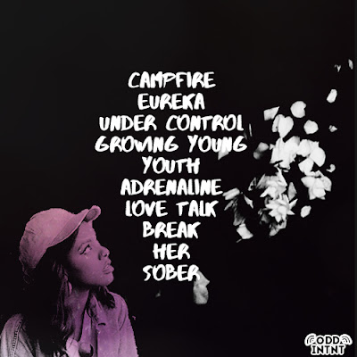
This was the first design of the back cover of our digipak. With the black background and white font, we designed this so that it was easy for people to read. We felt that our artist would want their music and content to be easily accessible for people of all abilities which is why we used the contrasting colours. Using a purple filter to colour in the artist, added the purple colour scheme back into this part of the digipak however, after discussions, we felt it wasn't enough purple and it wouldn't create synergy with the rest of the digipak. 

We also finalised a logo, seen at the bottom of our album cover. We also need to include other company/record label logos, barcodes, explicit content warnings etc. 

Monday, 9 November 2015

Music Video Editing

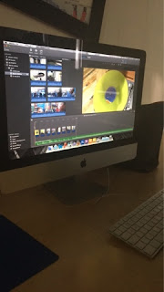
We edited our music video very easily initially. We wanted the shots we had filmed to flow in time and highlight the beat of the song which is something we focused on during the beginning of the music video.


When it came to editing we realised we had more filler shots than shots of myself lip-syncing which meant that overall the music video began to look more of a montage of shots rather than an actual music video. We decided that we would need to re film so that we could include more shots of myself lip syncing. I feel that so far, the music video does look very good, there's a clear theme running throughout and the aesthetic that we hoped to achieve, I think we achieved. There was a few shots we were unhappy with such as one of myself lip-syncing, once we fit it in we realised that it didn't match in time with the music so we'd have to reshoot that. 

We also discovered it was very easy to edit the match cuts together and it looked very impressive, a key shot that stood out amongst our music video, it's something we want to film more of so that it can become more of a theme that runs throughout our music video; seen hopefully two or three times in total.

There was a few shots we didn't like the lighting in, such as the intertextual shots but we changed this by editing the colour. Originally the shots looked very blue and so after changing the lighting we managed to make my body look like a silhouette and the projection the focal point as a tongue in cheek reference to the band, The Internet. 

In the end we managed to use a 60% filler shot, 40% lip syncing shots to complete our music video. Whilst we know we aren't finished, we wanted to make sure that we had used enough shots so that essentially the music video editing is done and therefore once we reshoot we can just replace any shots we don't like with the new ones.

Now we can focus on the poster and digipak.

Wednesday, 4 November 2015

Intertextual Reference

We decided our music video needed more dynamic shots of myself and so we wanted to include an intertextual reference of The Internet.

We wanted to film a few shots that looked completely different to the rest of our music video; we considered the idea of silhouettes and so we decided to film some shots of myself in front of a projector. Using The Internet and their music video for Get Away as an intertextual reference, we captured a few shots of myself dancing in front of the screen.


I think the overall shot ended up looking good and fit the theme of our music video. When reviewing our content, we realised several people had similar ideas, so we decided to create something slightly different. Whereas most people had overlayed their background image on top of their artist, we decided to completely blank out our artist to show her silhouette. We felt that by doing this, this scene would stand out and add some contrast.

We wanted to include an intertextual reference into our music video as we knew it was something Andrew Goodwin had mentioned in his theory of music videos. We wanted our music video to be memorable and distinguishable from others with a similar genre so we decided to include almost a tribute to the original group, The Internet, in the background.

We felt that 'Get Away' aesthetically fit the theme of our music video and so that was why we chose that particular music video of theirs to play in the background. This song also came from the same album, 'Ego Death' as 'Under Control', which meant that they had similar themes and references.

I personally think that the silhouette ended up looking very prominent and stood out. The artist was able to be noticeable against the background.

EDIT

Initially, Mr Higgins had stated that he felt that this particular scene didn't work with the rest of our music video; and so after refilming some of our shots, we reworked these scenes and they fit a lot better.

Monday, 2 November 2015

Music Video Filming (Behind the Scenes)

We filmed in two main places, the busy location of Camden which features a lot of street art and vibrant colours and the much more calmer and overall serene Camber Sands. We purposely wanted the two locations to contrast each other which would make the music video much more visually entertaining to watch.

Camden & Camden Lock

Filming in Camden proved to be very straightforward we had no problems and I found the lip syncing very easy although at times I was a bit nervous to do it in public, I think it became easier as Milly was filming and therefore had a camera so it made what we were doing a bit more obvious. Choosing to film in quirky, off the cuff places such as graffiti walls and small niche places that featured nature or bright neon lights really helped convey the overall look we wish to achieve for our music video. The lights would have looked a lot more nicer and brighter if we shot at night, but we were conscious of loosing light and filming enough footage. A lot of the shots we filmed were filler shots, small shots that could be used as a transition piece in our music video; these featured both Charlotte and I. Whilst filming Milly also took pictures that could be used for our poster and digipak as we were keen to make sure that a similar theme runs throughout.


Camber Sands

Our second location we filmed in was Camber Sands, a small sandy beach on the coast of Camber. Once again we filmed a variety of shots, I really liked the camera angles we achieved when I was lip syncing as it will make the music video a lot more visual. We wanted to complete a match cuts that we started in Camden, a medium over the shoulder shot of Charlotte and I. I'm holding a picture and I look over my shoulder at the camera which is something we matched up. I was surprised at how easily we managed to frame the shots so it would edit together seamlessly. We again filmed some filler shots of Charlotte and I walking which we could edit in to show mirroring between the two locations. We decided we wanted to use a pan to end the song and decided to record it with myself sitting down and looking up at the sky. One problem we encountered, besides the cold temperatures, was the camera. We shot mid afternoon, just before sunset, however the camera couldn't detect the difference between the sea and the sky and so it blurred the two colours together and made a lot of the shots look white.