Monday, 19 October 2015

Storyboarding

When creating our storyboard we knew it wouldn't match the music video exactly as we were going for a conceptual music video and we were also filming on location which meant there was a lot of factors that might have hindered us from achieving the camera shots/angles we hoped to achieve. 


A lot of the storyboard are various ideas that we had for the music video that we hope to try out and then we'll review the footage later. We decided to structure our music video like this because its conceptual based and therefore it's hard to determine how it'll turn out. Ideas for a good shot might not look as visually pleasing as we had originally hoped once we look back on it; likewise we might have really good ideas for shots but when it comes to filming on location it might not work or unforeseeable factors might prohibit us from filming. 


We hope to include a variety of angles and shots that fit with the conceptual theme as well as using clever editing to show match cuts. We gained a lot of inspiration from both Western and international artists and their music videos; the idea of using a cleverly editing match cuts 0i...
s something we want to try as we feel it'll make our music video stand out and link nicely with the concept that we are hoping to achieve. Low and high angle shots is another thing we hope to try as it makes the content more interesting for audience members to watch, it forces them to watch from another angle that they're not used to watching content from - therefore it stays longer in their head.


Overall, we want the music video to have a chilled, relax sort of vibe about it. We want it to be aesthetically pleasing to watch and therefore hope to have a colour theme that runs throughout. We want the visuals of the music video to reflect the message of the song, that the protagonist has it under control but there's an element that is slightly slipping, a facade. 

Friday, 16 October 2015

What is a Poster?

For part of our coursework, we have to create a music poster, which advertises our artist's debut album effectively, keeping in with the conventions of a poster.

Conventions of a music poster:

  • General colour scheme
  • One main image
  • Image should represent album/artist
  • Similar theme to album

For the poster, we decided to shoot pictures when filming as we'll be able to have a similar theme throughout, which will fit the conventions and help the consumers and our target audience find the correlation between our ancillary texts. We thought of using a naturalistic shot so that it would work well with the nature theme for our digipak, as well as referencing the music video.

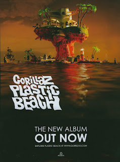
Gorillaz - Plastic Beach


In this promotional poster for band Gorillaz, it features one main picture - the location and inspiration for the album title. The text then appears over the top and features hardly any information. It simply states the band's name, album name, the release date for the album, the artist's website and finally the record label. The dark tone sets the theme of the album and music genre, Alternative Rock.

One element I really like from this poster is the font used for the title and the way it has the wave motion which reflects the sea underneath. This is something I'd like to incorporate into our poster as it would link nicely to our nature theme,

Ariana Grande - My Everything 


This album poster, likewise to the Gorillaz, has one main image of the artist this time. The colour scheme is kept black and white, with only the album title in a soft pink which alludes to the Bubblegum Pop genre of the album. This poster has more information with several collaborative artists being listed, which is a technique used to encourage consumers to buy the album as they'll hopefully recognise some of the featuring artists. This poster also has the release date, a website and the label logo on the bottom.

The key things that stand out besides the artist who is placed in the direct centre, is the title of the artist and album and the release date; as clearly they are the most important. However, the extensive list of featuring artists draws and captivates attention and so this is possibly something we might consider including in our album so that our artist can get a wider range of marketing and promotion. 

Thursday, 15 October 2015

Production Schedule

We plan to film for the length of just over one week. Starting from Thursday 22nd October to Friday 30th October we intend to film our music video as well as take still images to use in our digipak and poster.

Monday 26th October: Planning preparation
Tuesday 27th October: Train/Camden/Tube station filming
Wednesday 28th October: Digipak/Poster photoshoot
Thursday 29th October: Camber Sands
Friday 30th October: Extra filming


Filming the entire music video will be Milly, whilst I will be the artist. To add context and a wider, diverse range of demographic we decided to choose Charlotte from the auditions to also feature in our music video; whilst she won't be lip syncing, she'll make the music video more visually interesting to watch. This is something that is done in many music videos, such as Dumbfoundead - BKFAM; the music video feature various people in the background who don't lip sync but add an extra dynamic element to the music video.


We'll be using a camera and a tripod to film our music video. The camera is able to take both high quality photos and shoot video, so we'll be able to film and take pictures at the same time if we need to. Using a tripod will allow us to film both high angle and low angle shots which will make our music video more dynamically interesting for the audience to watch. As we're creating a conceptual music video, it focuses more on the aesthetic feeling of the music video and the visuals which includes the variety of camera shots and angles.

We aim to film the entire music video during this week so that we can focus on editing. Once we've finished filming we can review our content and once we edit it together, we can decide if we need to film any reshoots.

Wednesday, 14 October 2015

What is a Digipak?

A digipak is 'a type of packaging for CDs or DVDs, typically made from cardboard with an internal plastic holder for one or more discs.' This is an aspect of the coursework; we have to design and create a digipak as part of our ancillary texts to go with our music video and fit our artist style. 


When planning our digipak, due to the fact that we had filmed in various contrasting locations; we tried to think of a theme that runs throughout. We thought the theme of nature could be interesting to work with, as we shot near a lot of plants in Camden and we also shot on the beach, so to show the contrast between the two locations would fit in with the theme of the song and the lyrics.

1975 - 1975


When looking at digipaks, the first I decided to study was 1975's self titled debut album. They establish the style of their music very quickly by the use of their monochromatic colour scheme. Keeping this theme throughout, even on their physical CD, their Indie Rock genre is not shocking for the consumer. It informs possible consumers on their brand, image and style before they have even brought the product.

This inspired us when discussing and planning our digipak, we wanted our artist's distinct style to be expressed through the synergy across all our ancillary texts. We also wanted our colour scheme to express our artist's style and overall sound of music so that our consumer would be able to judge what genre of music they'd be paying for.

The 1975 also have a thanks page in which they pay thanks to all that have helped them along the way. This is important for a debut artist as it acknowledges several people in the industry and helps them make connections, it also gives an artist an opportunity to thank fans, which helps them gain more and therefore propel their fame and career.

Will Harrison - A Place Called Home


In this digipak, likewise to The 1975, the artist style is very distinct, American Folk, Country. Will Harrison also has a theme that runs throughout his digipak, so that fans can see the similarities across it. The background runs across all the pages along with the tree; we felt that it would be effective if we had a nature element that could feature various times throughout. 

Tuesday, 13 October 2015

Prop and Costume Planning & Research

Keeping in with our artist style mood board we wanted to go for a casual look for our music video as it reflects the feel and message of the song. We didn't want to use props as we felt it was unnecessary and wouldn't fit in with our concept.

Again with costumes, we felt that both Charlotte and I have a similar sense of style which represents the look we're going for in our music video.

EDIT

Now having filmed, I feel that my Camden outfit fit the artist style mood board that we created earlier on.

It features the use of a denim jacket and noticeable sports wear brands such as Nike, which help make the outfit anonymous.  The colour scheme is mainly soft pastels which fits well with the colour palette of Camber Sands and matches with the sea.

Adding touches of base metals such as rose gold jewellery helped these items sound out against the soft muted colours in the music video.


When we filmed in Camden Lock the second time, I went for a casual urban style which fit the location.

Wearing a large, bright green Nike branded hoodie would allow myself as an artist to be noticed and help make our music video stand out. It also fit in well with the bright colours of our location and the bright themes we aimed to include throughout.

Wearing an Adidas beanie did conflict as I was wearing two well known, popular and hugely successful sporting brands. However, this would only draw more attention to our artist and their choice in style.


This chosen outfit was worn during our Margate filming shoot. Adding a touch of femininity to all the previous looks we has decided upon, this stood out and soon became one of my favourite looks.

Still keeping with the brands theme, I wore a vintage Nike cap and an Adidas top. We felt that it could become a running joke for our artist, a way for her fanbase to identify her, by consistently mixing popular brands. Wearing an oversized jean jacket added masculinity back into the outfit, along with the black lace up boots which helped us stick to the anonymous style we wanted to achieve.


Monday, 12 October 2015

Independent Record Label Logo: Odd Internet

As mentioned in an earlier blog post, we created Odd Internet as an independent record label.


We designed this simple, yet effective logo that would allow our brand to become distinctive compared to other logos. The black and white colour scheme stands out against colourful backgrounds, which is something we intend to have as a running theme throughout our ancillary texts. The shortening of the word 'Internet' to 'INTNT' was done to make the logo more current and contemporary; it also looks stylistically pleasing to look at. It makes the logo shorter, impacting and snappy. The two symbols at the top represent both sound waves that comically are seen projecting from speakers but also links to the WiFi symbol. The sound waves instantly inform the consumer that this is a music industry company and that we release music. The WiFi connotations link back to our name 'Odd Internet' which stems from the two groups we took inspiration from when creating our artist, 'Odd Future' and 'The Internet'. The name indicates that as a company we have future aspirations that aren't solely focused on music, we intend to reach our consumers on various media platforms such as using the internet to achieve this.

Friday, 9 October 2015

Auditions

We held auditions for someone to feature in our music video alongside myself and whittled it down to a total of four people. The person we cast isn't required to lip-sync as they aren't the artist, I am, and so they will be used purely to make the music video more dynamic and visually interesting. 


Sophie Baxter

Sophie had a good sense of fashion, which is something we were keen about because it's something that's important to our conceptual music video. Whilst she does have a good sense of fashion, overall we think it doesn't fit the theme we wish to portray and the message of the song/lyrics.


Georgina Welton


Georgina looked like she fit the general look we was going for; however there was a few things that didn't fit our concept - such as her fashion style. Whilst it was good it didn't match the casual almost androgynous look that we hoped to achieve, Georgina overall is a lot more feminine which reflects in the way she dresses.


Caitlin Mettle


Caitlin looked too sweet to cast in our music video; through no fault of her own if we had casted Caitlin she would have made the music video seem almost too youthful. Her fashion sense fit the theme and overall concept which is annoying as she would have been the perfect candidate.


Charlotte Springate


Charlotte was the ideal candidate. Her fashion sense matched the concept completely and she also had the right mix of androgyny which fit the aesthetic we were hoping to achieve. 

Tuesday, 6 October 2015

Lip Syncing Exercise

We created some lip syncing videos, as practice for when we film our music video. We decided to film two to highlight the difference between lip syncing song vs rapping.

The Internet - Under Control: Lip Sync


This is the chorus of Under Control, the song we're planning to film our music video to. We felt it was important to get some experience with lip syncing before filming.

The chorus itself is quite slow which made lip syncing fairly easy to do. The technique we used was playing the song out loud and lip syncing to that; when it came to editing we matched the music to the video, which didn't take too long. When filming in the locations we plan to, especially London Underground and Camden, it might prove difficult to do so as the location is loud which means listening to the track will be hard. This is something we can't do anything about for now, as it depends on how busy the location is when we arrive. One idea is to use speakers when filming in loud locations, but then it might be difficult to place them out of shot during filming. I've noticed that I found it difficult to look directly at the camera when filming, which is something I'll have to improve on when we actually film as it's crucial that in music videos there are shots where the audience can clearly identify the artist and therefore build a relationship with them, which is a theory Andrew Goodwin states. 

Overall, I found lip syncing to this relatively easy, which gives me hope for when we film. 


Nicki Minaj ft. Beyonce - Feeling Myself: Lip Sync 


This is the chorus to Feeling myself, we chose this song to highlight how different it is lip syncing to a fast paced rap compared to a song. 

The chorus is fairly fast, but I didn't find it too difficult to rap to, I found that it was a lot easier to lip sync at the camera compared to Under Control. 


There was many challenges we faced as this was the first time I had ever lip-synced on camera. We decided to play the song from my phone which sat next to me out of frame; this worked as we were alone, but when filming in Camden which will most likely be busy - it might prove difficult to use this method when filming the music video as the background noise might be too loud to hear the music. Another challenge we faced was the weather conditions, it was quite windy when we filmed which wasn't too much of a problem but again when filming in a busy location if the weather isn't that good such as rain or wind, this could have an adverse affect on our filming and delay us. Although there is no real way we can control the weather to suit us when filming; we can plan our filming schedule so that if it does happen to rain, we can film some shots inside and wait for the weather to improve. We have the benefit of creating a conceptual music video which means that we've decided not to have a set narrative but rather aesthetically pleasing shots that all together create the similar feeling of the music.

Monday, 5 October 2015

Artist Inspiration: Syd tha Kid/ The Internet

When creating our artist we used the front woman of The Internet, Syd tha Kid, as inspiration for costume decisions and overall look.

Syd dresses in an quite an androgynous way and so we similarly wanted to style our artist like this so that our artist would be accessible to the majority of our audience. We didn't want to exclude certain demographics of our target audience by projecting a hyper feminine or hyper masculine look. Detailed further in this blog post, I talk about specific outfit choices and explain the reasoning behind them.


The Internet have quite a distinct sense of style and something we tried to replicate. As a group, they give off a chilled, relaxed atmosphere which is reflected in the music they produce and so we tried to recreate this by combining all the members' individual styles into our solo artist.


Often in their music videos, they feature shots of the group playing music instruments and despite the fact that our artist is solo, we consciously decided to stray away from this convention as we wanted there to be distinct parallels between our final media product and several of The Internet's music videos.


Sticking to basic colours and branded logos helps our artist establish themselves and their individual style, which would resonate with our target audience. It also would allow for possible marketing opportunities which would further help us market and promote our artist to a larger demographic of audience.

Friday, 2 October 2015

Artist Style Mood Board


We created this mood board to display many of the inspirations we had for our artist style.

Our general look is a casual look that fits the multitude of locations we plan to film in; Camber Sands, London Underground and Camden. We decided not to go for a strictly feminine fashion style, hence why we included some photos of men for inspiration; an androgynous style would appeal to a larger audience and is more inclusive of a wider variety.

Keeping both hair and make up quite simple fits with both the music style, genre and theme of our music video which is something we hope to do.

The leader singer of The Internet, Syd tha Kid, has an androgynous sense of sense and overall look about her; which fits well with the type of music they create - which is why we hope to stick to this.

Thursday, 1 October 2015

Music Video Inspiration Mood Board

After gathering more of an idea of what we wanted to include in our music video, we created more detailed mood boards.


We created this mood board to highlight some of our inspirations for our music video. We aim to make something aesthetically similar to this.

Filming on location means you can never be sure of what is going to happen in terms of weather and setting; so some of the inspiration reflects this. As we're going for an aesthetically pleasing music video, a lot of the shots we aim to capture will be ones of the scenery and the location hence some of the outside pictures where the location is largely seen.

We aim to capture the protagonist(s) doing mundane things whilst creating good cinematography which fits in the style of the music video. There isn't much of a narrative storyline to the music video and so this gives us more of a chance to use a variety of shots, editing techniques and special effects.

Having a running theme such as pastel could be beneficial, but rather than aim to have a theme and once we film not be able to achieve it; keeping it as inspiration is best, as it's something we can perhaps incorporate but don't have to stick to it.

Clothing is important as they often match the music video and location; which is something we'll have to take into account now we've decided a location. In all of these music videos, the fashion style matches and helps fit the aesthetic of the overall video, which is something we aim for.