Friday, 18 December 2015

Final Music Video


This is our final and finished music video.
Lia Tamera - Under Control 

Thursday, 17 December 2015

Final Magazine Advert


This is our final third finished ancillary text - our newspaper advert.

Final Poster


This is our second final, finished ancillary text - our poster.

Final Digipak

This is our first and final finished ancillary text - our digipak.
Lia Tamera - The Kids Aren't Alright

Front Cover


First Inner Cover


Second Inner Cover 


Back Cover

Spine


Tuesday, 8 December 2015

Editing Inspiration: Anderson .Paak

When editing the beginning of our music video, we decided to play with and make use of the music in order to fit it in with the jump cuts; this way our audience would be more likely to relate the beginning of 'Under Control' with the music video, helping to create synergy.


The idea for having the opening second shot in black and white as well as the placement of the font was from singer/producer Anderson .Paak and his 2014 song 'Luh You'. We felt that this would make our music video stand out and become very distinctive.


The quick cuts show different symbolic moments of the music video so that audience members can catch a glimpse of the different elements of our music video. We chose to use shots that featured our artist near nature as this would contrast greatly with the array of colours we later show in the music video.

The idea of the font also came from this music video as it distinctly informs the audience of the song title, artist and director in an artistic style.

Friday, 4 December 2015

Editing Inspiration: Beyoncé

When editing our match cuts, we gained inspiration from other artists. Beyoncé's 2006 song, 'Freakum Dress' features several of these shots in which she changes outfit. We were influenced by this and tried to recreate it in our own way.


In this shot, you can see our artist changing her clothes in a photo booth. After being influenced by Beyoncé, an artist who fits into the musical genre we're basing our artist on, we decided to similarly change her outfit in a quick match cut. Looking at this shot, I realise that the lighting seems quite warm and therefore heavy on the yellow tones, especially due to the harsh light on the left hand side of the artist's face due to the photo booth we shot in and so this is something I'd like to change if we had the technology to effectively alter it, without the shot looking too distorted.
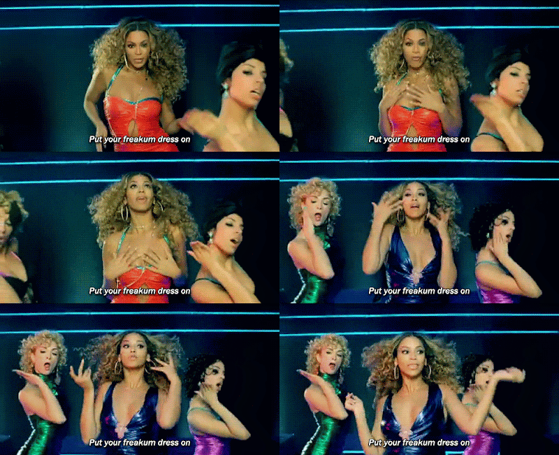

In Beyoncé's Freakum Dress, you can see a similar match cuts where she changes her outfit mid shot, which allows the audience's attention to focus to that aspect which relates back to the lyrics of her song. We chose to highlight the clothing in our music video, in particular in this shot, because we wanted to reference back to our target audience and the fashion style that they are used to; which would therefore allow them to relate to our artist, which makes our music video accessible to a larger audience.

Thursday, 3 December 2015

Editing Margate Footage and Feedback

When editing the footage from Margate we came across one problem which we worked hard to correct. During the arcade shots, there were people in the background and so we tried to edit around them when editing our music video. In order to do this, we inserted other clips and used jump cuts to flick between the two. I think in the end this looked effective.


When we received feedback from Mr Higgins, he said there was one shot he liked by far. This shot taken in Margate on the beach features, me as the artist, walking along a sand dune. Mr Higgins said he liked the equality of the shot, how it was mirrored nicely, the artist was in the centre of the frame and the colours of the shot contrasted nicely.